Project Summary
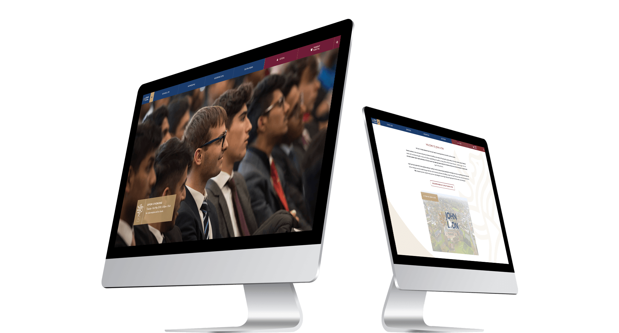
John Lyon School had recently gone through the process of updating their brand guidelines – the logo had been completely modernised, from a lion within a crest, to a standalone outline icon drawing which is easily recognisable, clean and minimalist. A wave shape inspired from the lion icon was a newly created brand asset to help tie elements together. The brand colour palette had also been re-considered simply by making the heavily used primary colours into accent tones, and introducing a lot more white to sit in-between the brand assets, overall creating a very expensive aesthetic.
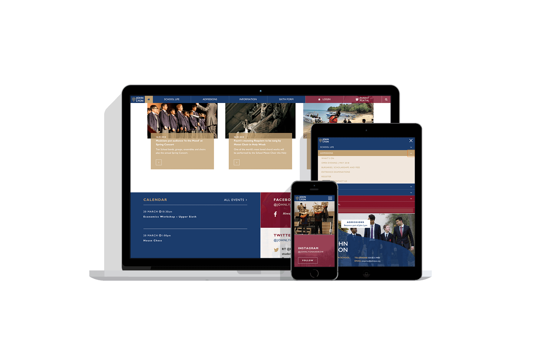
Now needing their website to reflect the brand changes, John Lyon contacted mso. Our design team produced a range of concepts which were presented to the client and narrowed down. To give the site components a lot of variation, and to not overuse the blue / red we worked with opacities of each colour, and built up the colour in layers as a way of adding depth to the site as well. It was also good for showing different levels of navigation. The client was really happy with this approach, and felt it complimented their new printed media well. The task now was to decide the order of content, and consider all the different components the client may need within a page.
As per the minimal brand guidelines, it was decided that animations should be subtle, through simple colour reversing, and triggering as the user interacted with the page, on scroll, hover / touch to keep their engagement. Navigation for this reason was condensed to top level only on the homepage desktop experience to keep the header section as uncluttered as possible, and again to avoid over-complicating animations for example with drop downs, or an expanding mega-menu.


