Having a clear, succinct navigation is such an integral part of your school website, but how can you optimise your navigation design to create the best experience for your users?
Designing the best school website navigation
02/05/2023
And a clear, succinct navigation and good user-experience correlates with their willingness to stay on the website to find out more about your school.

It’s easy to spot an old and dated school website, as the site navigation tends to be overwhelming and confusing.
It’s often as a result of years and years of growth of the site content, without consideration as to where the new content fits into the website journey,
But this can be a huge detriment to the website experience as a whole, as the navigation is such an integral part of how your users interact with your website.
If your users can’t find the page they are looking for, that’s a problem.
As such, we’re putting the spotlight on your website navigation, its definition, importance and tips on best practices for this fundamental element of your website.
What is website navigation?
Your website navigation is a visual representation of the structure and hierarchy of your website’s pages.
It is also the function that allows your website users to journey through the site that transports them to other pages that are of interest to them.
Website navigation examples: one-size doesn’t always fit all!
When people think of website navigation, the standard horizontal list of links that appears identically across all of the website pages, often comes to mind.
But there’s also additional types such as secondary, tertiary dropdowns that are ordinarily accessed through interacting with the main nav bar, and also as standalone elements on internal content pages.
Even links within your site’s content, that link internally to other pages on the site, are a method of navigation.
Given that navigation is so multi-faceted, let’s look at the different types of navigation that you can use on your school website.
Horizontal Navigation Bar
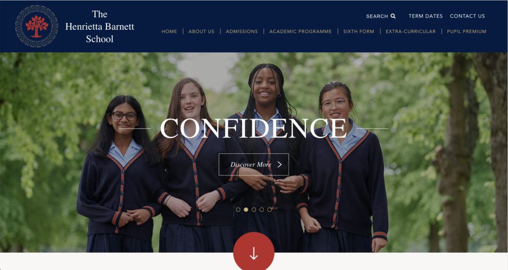
Example of a horizontal navigation bar style
Image source: The Henrietta Barnett School
This is perhaps the most common type of navigation.
As the name suggests, it’s a bar that sits horizontally, often at the top of your webpage.
It lists the major pages, or primary pages side-by-side in a prominent and accessible way and should be customised to suit your school’s offering.
Just be sure to follow best practices detailed further into this post.
Sub-navigation
Sub-navigation allows users to locate lower level content within a website, as subcategories of your main, or primary navigation links.
Sub-navigation can take a number of different forms, whether as a dropdown menu that appears on hover of a primary navigation item, or as a static element that complements body content on the website’s internal content pages.
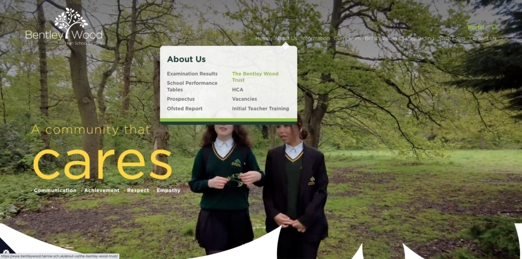
Example of a sub-navigation as a dropdown from the main navigation.
Image source: Bentley Wood High School for Girls
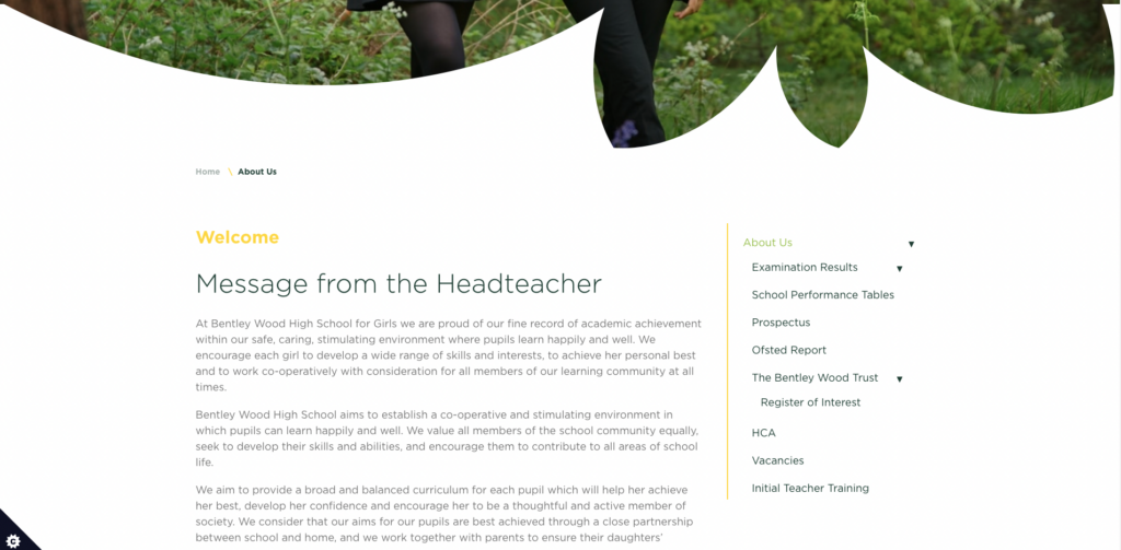
Example of a sub-navigation as a static element within a content page.
Image source: Bentley Wood High School for Girls
Hamburger Menu
Traditionally consisting of 3 horizontal lines, this icon was aptly named due to its resemblance to… well a hamburger.

Image source: Kuka Studios
Its initial conception, by designer Norm Cox, dates back to 1981 with its purpose, to provide a simple, functionally memorable “road sign”.
Whilst it wasn’t heavily used back then, the popularity of smartphones and the necessity for mobile-friendly websites saw its reemergence.
The hamburger menu provided a perfect way to fit a multitude of navigation items onto the tiniest of screens and has become a recognisable feature on modern-day websites.
It’s even utilised for desktop versions of websites too to allow heavy media to take the forefront for some visual website experiences.

Example of a burger navigation on a mobile version of The Tiffin Girls’ School website
Image source: Tiffin Girls’ School
Content oriented navigation
Signposting
Signposting plays an important role in a user’s journey around your website.
It can be utilised to provide easy access to key information on the website to support your standard navigation types.
Or additionally it can be used in content to encourage a user to continue their journey throughout your website.
We always advise clients to utilise signposting at the end of content to direct users to other relevant content, as opposed to a proverbial ‘dead-end’.
Signposting can take many forms, from standard buttons that deviate in design to draw the eye, or something more visually appealing like image signposting.
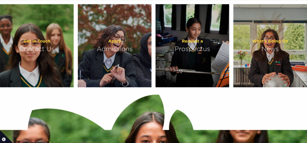
Example of visual, image focussed signposting.
Image source: Bentley Wood High School for Girls
Internal Links
An internal link is a link from one page of your website to another internal page.
Internal links are not only great to guide your website users to related, relevant content, but they’re great for optimising SEO too!
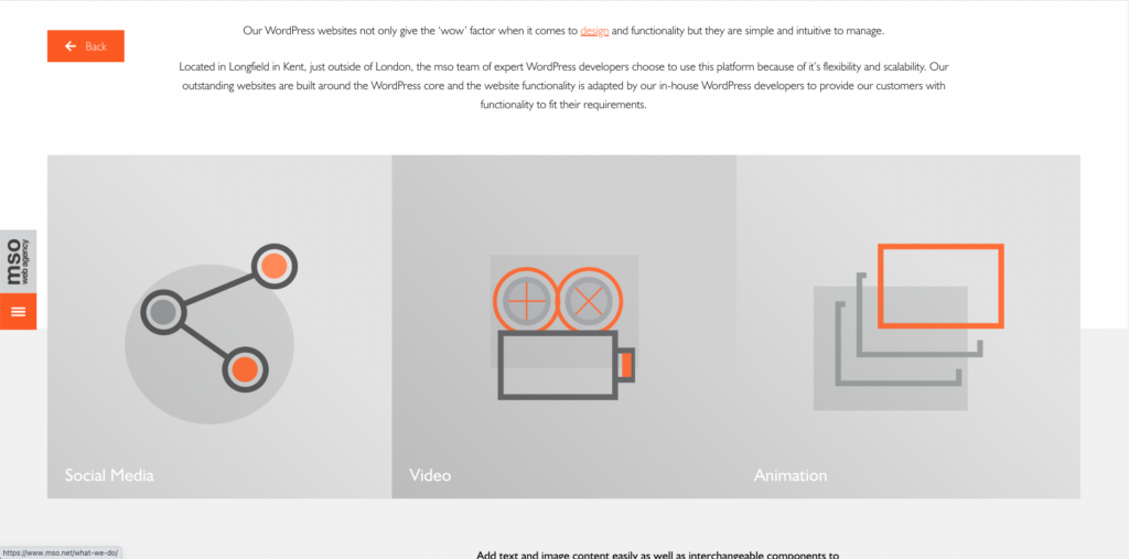
Example of an internal link (text highlighted orange)
Image source: mso Web Agency
Footer navigation
Footer navigation is fairly self explanatory, it’s a collection of page links that preside in your website footer.
Generally, the footer navigation contains links to prevalent policies e.g. Privacy Policy, Terms & Conditions, but can also contain links to other areas of the website too.

Example of a type of footer navigation.
Image source: The Henrietta Barnett School
Website navigation, best practices
With any type of navigation, usability is a key issue for site visitors.
In fact, according to a study by KoMarketing, 37% of users say that poor navigation and design cause them to leave websites
With that in mind, let’s look at how best website navigation practices can be adopted by your website.
It’s all in the planning
The order of your navigation menu needs to be precise.
It’s for this reason that we discuss the site hierarchy and overall architecture with clients before even starting to build the website.
And these decisions should be specifically based on the goals of your website, tell a story and steer different user types to the content that caters to them.
And if you already have Google Analytics on your website, this can be used to influence decisions by utilising Behaviour Flow to visualise what path users use to travel from one page to the next.
Get straight to the point
You want your website users to be able to understand what you’re trying to portray and where you’re trying to direct them on the website.
Therefore using vocabulary and terms that are understandable to your audience is such an intrinsic part of a good website experience.
Steer clear of technical terminology, jargon or vague navigation labels.
These labels should speak in terms that visitors can understand naturally, but be descriptive as to what content users should expect to see on the destination page.
Keep it simple
We’ve all heard of the saying, ‘less is more’, well the same can be said for navigation.
Human short term memory can remember about 7 items at once, so the optimum amount of primary navigation items should really sit between 5-7 options, any more than that, and you’re in danger of overwhelming your users.
In terms of additional levels of navigation, ideally you want users to be able to find information as quickly and in as few clicks as possible.
We would therefore advise that you try and limit (if at all possible) navigation to 3 levels; primary, secondary and tertiary.
Define a style
As a gateway to the other areas of your site, navigation should have a definitive, consistent style across the website.
Your primary navigation should be prominently displayed, easy to see and not obstructed by any other website elements that would affect how a user interacts with it.
Equally important is how any secondary / tertiary navigation functions, whether it’s a drop down menu, or sits on a content page alongside body content.
Also consider how easy it is to access the navigation at various stages of the website journey.
For example, if you have a particularly long page that requires a lot of scrolling, either a stick navigation (that remains fixed to the page on scroll) or a Back to Top button are incredibly beneficial to the user experience.
Use Mobile Responsive Navigation
Mobile experience matters.
83% of mobile users say a seamless experience across all devices is vital.
As such, special consideration as to how your navigation performs on mobile devices is crucial.
The hamburger menu is very useful in ensuring responsiveness across devices and can kick into action once the device gets to a certain size.
This makes for a consistent experience for your users, regardless of what device they are using.

Watch how a traditional style nav snaps to mobile ‘hamburger menu’ on different device sizes.
Our takeaways
It’s often easy to forget that there are humans on the other side of the computer screen.
And a clear, succinct navigation and good user-experience correlates with their willingness to stay on the website to find out more about your school.
It is afterall the core element that allows users to journey through your website to see what your school can offer, it should never be a barrier that users have to overcome.
Our advice is to always take the time to visualise how your sitemap will look, what content will appeal to what users and understand the easiest way for those users to get to that destination.
And as search engine bots value strong navigation, you’ll see discernable benefits to your SEO too to help your website reach a larger audience.