The phrase, ‘school’s out for summer’, often doesn’t apply to your school’s admissions and marketing teams who will likely be working tirelessly over the summer break to, amongst other things, achieve the school’s enrollment goals.
Tips on how to refresh your online admissions experience this Summer
31/05/2023
With no impending admissions deadlines, nor the normal day-to-day of term time school life dominating the to-do list, the summer months are the perfect time to refresh your online admissions experience.

Whilst others may be counting down the days until the summer break, this means very little for your school’s admissions and marketing teams.
Afterall, the drive to meet enrollment goals doesn’t stop just because student’s have downed their pencils until the dawning of the new academic year.
And with the absence of the usual hustle and bustle of school life, there’s a perfect opportunity to review, renew and revamp your online admissions pages.
As above all, a fresh, engaging online admissions experience is an intrinsic part of the admissions and marketing machine and integral to achieving the school’s enrollment goals.
In this blog, we look at ways you can refresh your admissions pages and really hone your school’s enrollment strategy to usher in the new academic year.
Do your research
The critical factor of any online admissions process is its usability.
If prospective parents, carers or students experience roadblocks or snags in the online admissions experience, this can equate to a negative impression of your school overall.
This is where using metrics from tools such as Google Analytics can prove very useful.
Analytical data will allow you to understand user behaviour, such as page bounce rate or average time on page, providing the catalyst to make informed decisions on how to improve the experience.
For example, if users are spending very little time on those important cornerstone pages, what’s the reason for that?
From here, you can look at how you can make this more effective.
Can the information be made more digestible? Can media be added to increase engagement? Can the design be updated for a fresher experience?
Data that informs strategic decision-making is the key to optimising the online admissions experience to guarantee its success.
Engage users and communicate your value proposition
Whilst the benefits of an independent school education are vast and considered a worthy investment for many, the admissions experience should never lead with a price-tag.
Instead, when a prospective family visits your website for the first time, your narrative should take centre stage.
Who are you, why are you worth the investment and what makes you different from your competitors?
And once your prospect has determined if your school is the right fit for their family, serve clear CTAs to direct them to clear conversion pages such as Apply, Enquire or Request a Prospectus.
Christ’s Hospital tells their story through a beautifully designed online admissions journey that combines image, video and testimonials to capture the essence of the school.
And at the end of the journey, users are shown clear CTAs taking them to those conversion centric pages.

For something a little simpler, yet still effective, St Albans High School for Girls’ admissions page features vibrant bursts of colour, powerful statements, clear signposting and statistics to tell their story.
As per Christ’s Hospital, the St Alban’s admissions journey culminates with conversion signposting for users to continue fact finding, book a visit, or get in touch with the admissions team.

Use images that capture the ‘now’
Regularly updating images throughout the online admissions experience is a nice quick-win for clients looking for a quick face-lift.
Not only is imagery easier to digest, (the human brain processes visual content 60,000 times faster than text), they also have a plethora of other benefits that can positively impact your admissions pages.
They can aid in your storytelling if you are utilising images that complement and support whatever content it is paired with.
They can also generate an emotional response from your users, which is why we always advise clients to use powerful, aspirational media for hero and header areas on the website.
Unsurprisingly, it’s for this reason that imagery of smiling, happy students is always advised on the admissions section, to communicate the warmth and buzz of the school.
So stay away from saturating the experience with images showing the campus and facilities as these are better suited for pages that are selling what the school has to offer.
We talk about how to showcase your amazing facilities in a recent blog post!
For repeat visitors to the website, even prospects who may not have converted last year, new images ensure that they’re not served the same browsing experience as before, so it feels fresh.
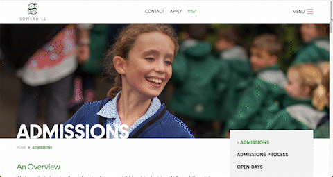
Somerhill’s admissions pages are a beautiful blend of imagery of their students and the grounds, providing a glimpse into life at the school and evoking the warmth and opulence of their school community.
Show results for results!
Academic excellence is something that independent schools are renowned for.
That being said, that doesn’t mean that you shouldn’t shout about your school’s accomplishments.
Stats provide great, bitesize tidbits of information that offer the wow-factor to prospective families.
Whether it’s showing grades, or name-dropping some onward destinations that include the best universities in the world, these stats are a great tool for admissions professionals and marketers alike.
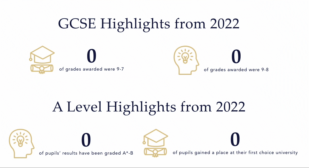
The example below shows how Cheltenham College use animated stats counters to draw the eye, engage and direct users off the relevant areas of the site.
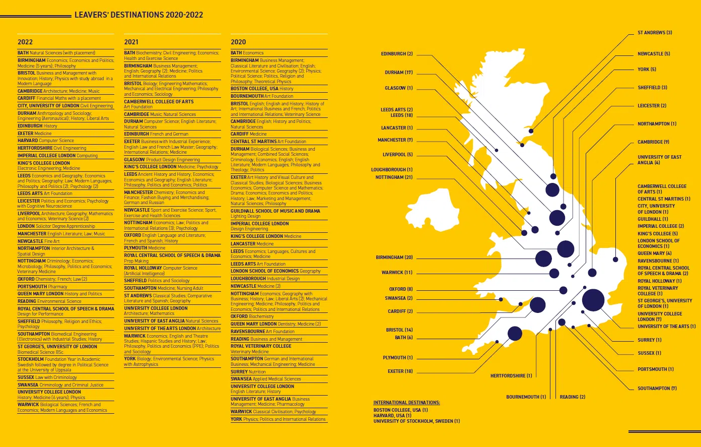
And STAHS utilise a branded, graphical element to show at-a-glance onward destinations.
Keep it simple and clear
Don’t make your users think – keep it simple!
Prospective parents, families and students need to be able to find the information that they need in the easiest way possible.
Whether achieved through clear navigation and site hierarchy, succinct signposting, or by intuitive features – user experience is paramount here.
Features that can enhance the user experience include;
- Online admissions forms – Intuitive online forms, with the facility to make payments and upload supporting documents is a welcome addition to your online admissions process. For longer forms, a ‘Save & Resume’ feature is great at allowing users to complete the form when it is convenient for them.
- Virtual open-day / Virtual tour – A glimpse into life at your school served virtually to prospective families who may not be able to visit the school in person. Virtual events provide accessibility and gain more reach than in-person events.
- An admissions calculator – Offering a slightly more personal experience, an admissions calculator essentially serves the user content relevant to them.Take Cheltenham College’s admissions calculator for example, which takes the stress out of the process by offering relevant, tailored information and signposting according to a user who has input their date of birth.

Integrations, for the wider admissions process
The website is only one of many elements that are intrinsic to the admissions process.
CRMs and MIS’ such as HubSpot, iSams etc are also fundamental to the marketing and admissions team in managing prospective admissions data effectively.
Integrating these external tools or software with your website will allow admissions data to flow seamlessly from website forms to your CRM database, negating the need for manual data entry.
Not only does this make for a more efficient process, but it also aids in tracking opportunities and scheduling and sending outbound content, alleviating some of the pressure on your internal team.
Once your tools are all working together, your teams can spend more time focusing on converting those enquiries and not on laborious tasks such as manually porting data from multiple systems.
Our Takeaways
With no impending admissions deadlines, nor the normal day-to-day of term time school life dominating the to-do list, the summer months are the perfect time to refresh your online admissions experience.
The admissions data accumulated throughout the school year, alongside advancements in technology, will present opportunities for admissions and marketing teams to grow and improve the current offering.
The ultimate goal – to create an engaging, fresh and intuitive admissions experience that ushers prospective families into your school community and contributes to the success of your admissions goals.