If your business materials are difficult to read, the user will not read them.
Share article
You may think branding and design is just for the creatives but it isn’t. If you are creating any business materials such as proposals, white papers, email campaigns or content, it is important to pay attention to your brand.
Firstly consistency is key, if you have brand guidelines stick to them. If they aren’t far-reaching enough, expand on them. Always keep in mind what your company values and style is before you send out a piece of work.
We’ve put together some tips on how great brands keep consistency through their stylings.
Colour
Be consistent with your colour palette.
You should have your primary colours (usually used within your logo) and a palette of supporting secondary colours you can use to inject some different tones when needed.
For all your colours you will require the colour codes to ensure every time you print or use the colour digitally they are consistent.
Print – Pantone or CMYK
Digital – RGB or Hex
Coca-cola is known for its iconic red brand colour.
Image & graphics style
Ensure all imagery is within the same brand style.
Whether you use icons, images, typography or graphics across your business materials it is important to ensure all brand imagery is within the same style. For example, if you use a linear icon (line drawing) within your brand you would not want to then use a block icon style in the same campaign, as this would not be consistent.
If you are running a campaign seasonally or for a product promotion ensure all imagery is within the same style for continuity so this can be seen as a whole.
It’s great to use different styles to represent different campaigns or products however you must ensure your main brand is still reflected in this.
Sainsbury’s use the same tone of imagery and typography across their marketing materials.
Content tone of voice
Maintain a tone of voice.
When writing any content, be it documents, adverts or social posts, it is important to maintain your company tone of voice across all platforms, so your reader or client can get a sense of your identity.
Each business material will have an individual feel due to its content, i.e. your social channels may be more cheerful than a fact-based proposal document.
Once you have written content, look across your previous materials to ensure if you are conveying the same sense of identity through tone of voice.
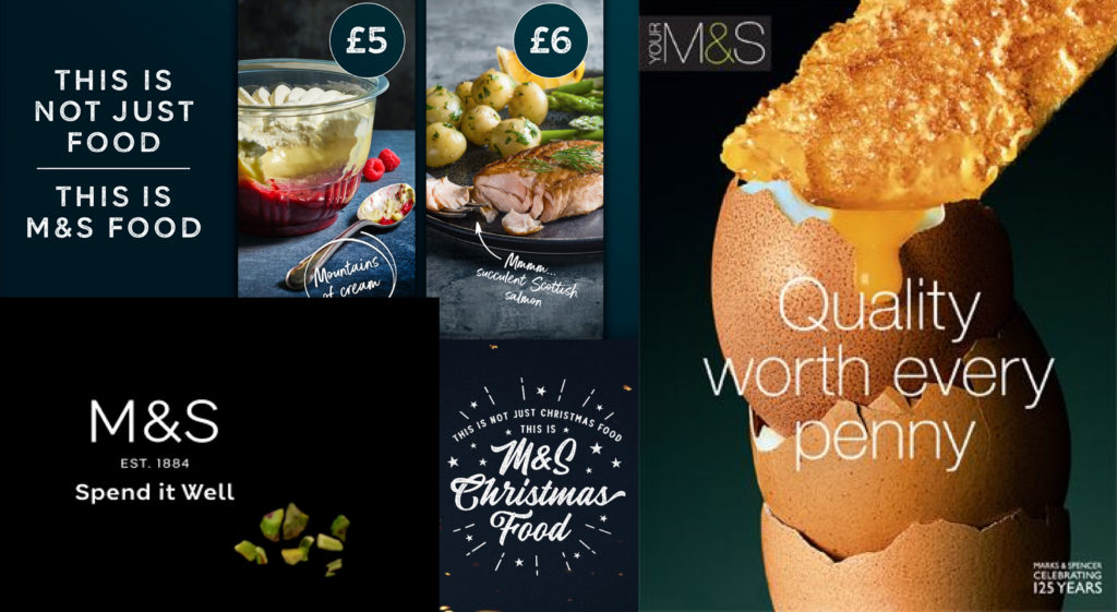
M&S food is known to have a confident and luxurious yet accessible tone of voice across their advertising.
Font pairing
Make your business materials easy to read.
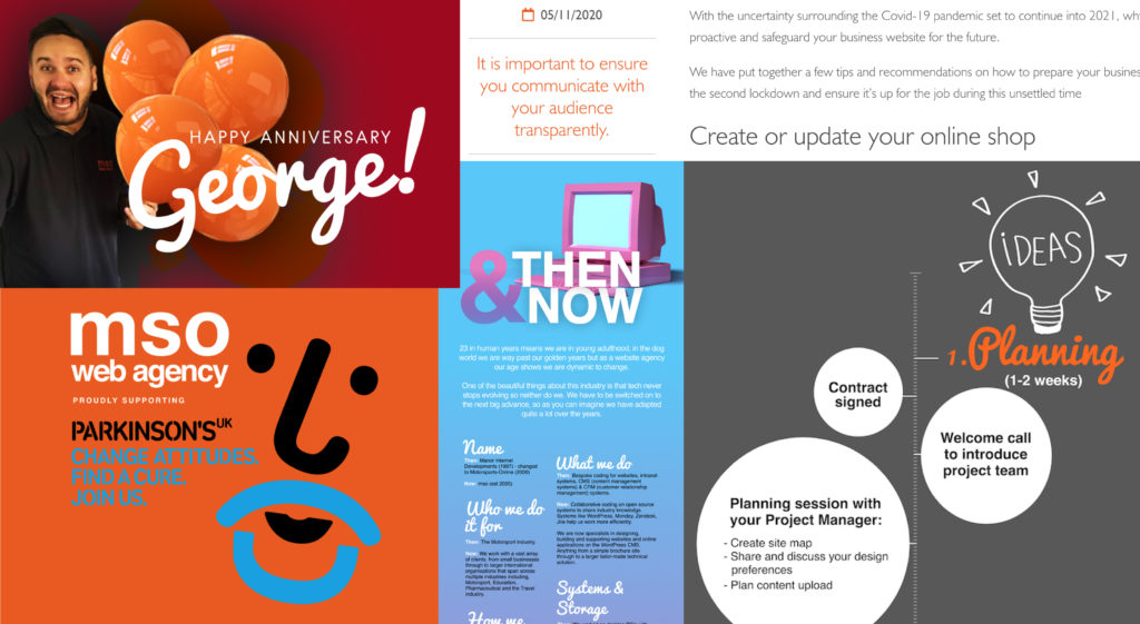
Font pairing is as important in a pitch presentation as it is in an advertising campaign. If your business materials are difficult to read, the user/reader/client will not read them.
You can make your words look more interesting and readable by using the below stylings to differentiate content such as headings, sub-headings, quotes and other variance within your documents.
Assign a role to each font or style i.e. all headings to appear in X font in X style.
Combine a serif font (decorative lines/tapers) with a sans serif font (simple font)
* However do not use more than 2/3 fonts per document as this will make the text look messy.
Use different font sizes.
Contrast your font weights & styles i.e. thin, bold, italic.
All of the above design tips come together in one place, on your website, so it’s important to be consistent and create uniformity when editing or building your site. If you would like to discuss your business materials, website or require some assistance with your brand guidelines, please get in touch for a chat.
If you liked reading this article you may also like: